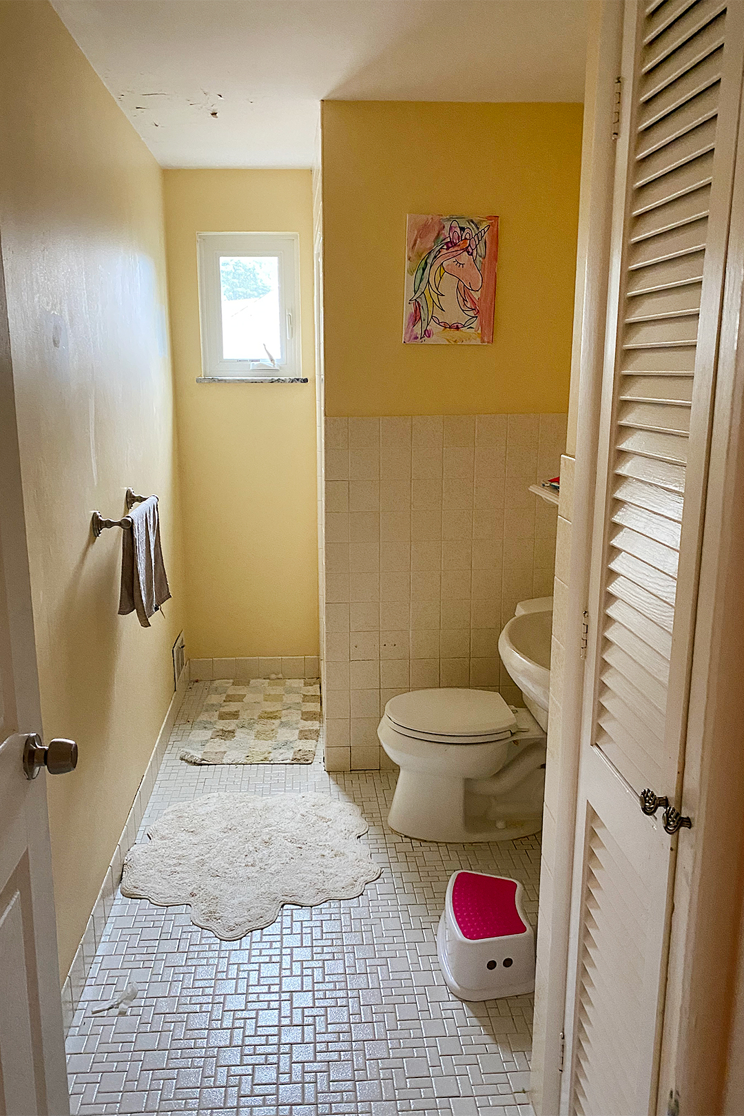
A shower stall is a perfectly acceptable spot to rinse off after you’ve finished a hot yoga or spin class at your local Equinox. But when you’re trying to get children clean and ready for bed, the tiny standing-room-only setup is “not ideal,” as designer Halle Baran of Sil and Park Interiors puts it. Most parents tend to agree, as was the case with Baran’s latest clients, a couple based in the Cleveland area who have three little ones (ages 6, 4, and 1 1/2) and reached out to her in desperate need of a proper kids’ bathroom with a tub. The catch: Baran only had 55 square feet to work with.
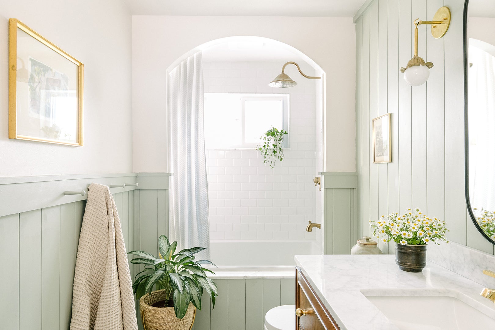
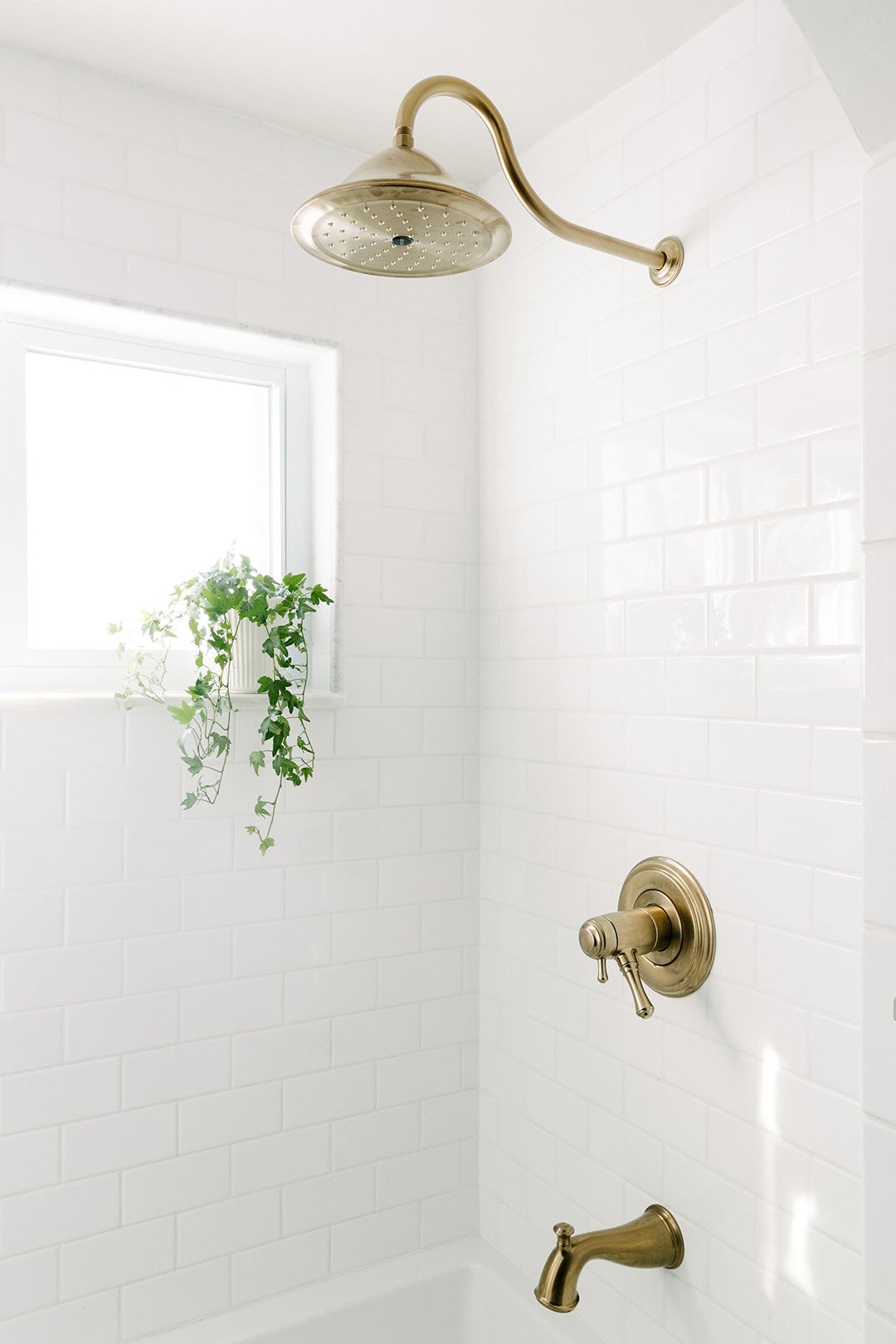
“The drop-in tub can feel dated sometimes, but I think it deserves a comeback,” says the designer. After gutting the children’s existing bathroom, Baran plopped in an alcove tub-shower from Signature Hardware where the old stall used to be, taking full advantage of the 60-inch-wide wall. And she replaced a rectangular window with a larger, horizontal opening, which floods the space with natural sunshine, making it look a lot larger than its small footprint.
Ahead, Baran outlines a few other key changes that took it from gymlike to bubble bath–friendly.
Storybook Architecture
During the mood-boarding phase of the project, Baran noticed her clients kept pulling up images of bathrooms with huge arches. “I was a little nervous because the room is so narrow, but I felt like it would give it a lot of interest and almost make the space seem bigger,” she shares. To make the opening work in the teeny area, she opted for a wide arc at the top and kept the sides of the threshold straight in an effort to make the tile installer’s job simpler (and ultimately less costly). The addition slightly bumped out the depth of the tub-shower nook to 40 inches, leaving plenty of room for Mom or Dad to sit on the edge during bath time without ramming their knees on the toilet.
To make cleanup time a breeze, Baran topped the window niche with marble pencil trim instead of continuing the 3-by-6 subway tile on the ledge. It’s easy to wipe down with one swipe, while grout lines tend to collect puddles of water that lead to moldy crevices.
Tight Shiplap
Covering the walls with shiplap was a cost-effective way to add character to the space. But the detailing had another covert benefit: It covered the exposed side of the tub for a cohesive built-in look. “We wanted it to have a more custom feel,” notes the designer. The Home Depot boards ($76 per box) were painted Blue Gray by Farrow & Ball; the top third of the wall and ceiling were covered in Simply White by Benjamin Moore.
Vanity Fair
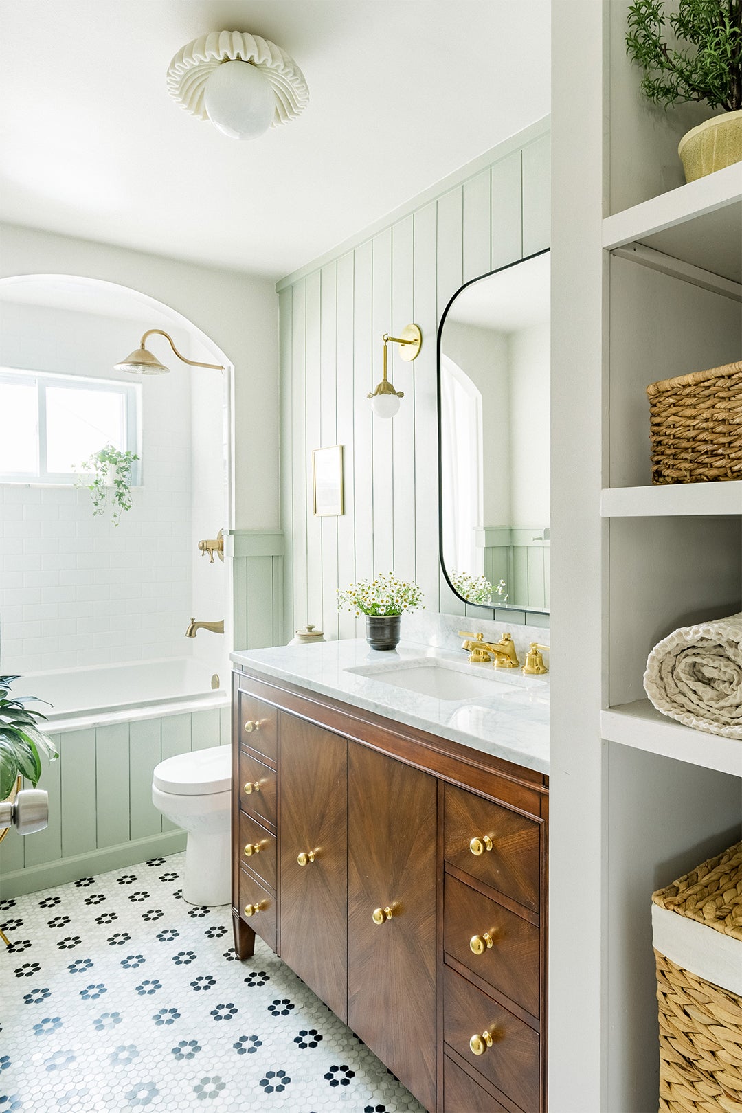
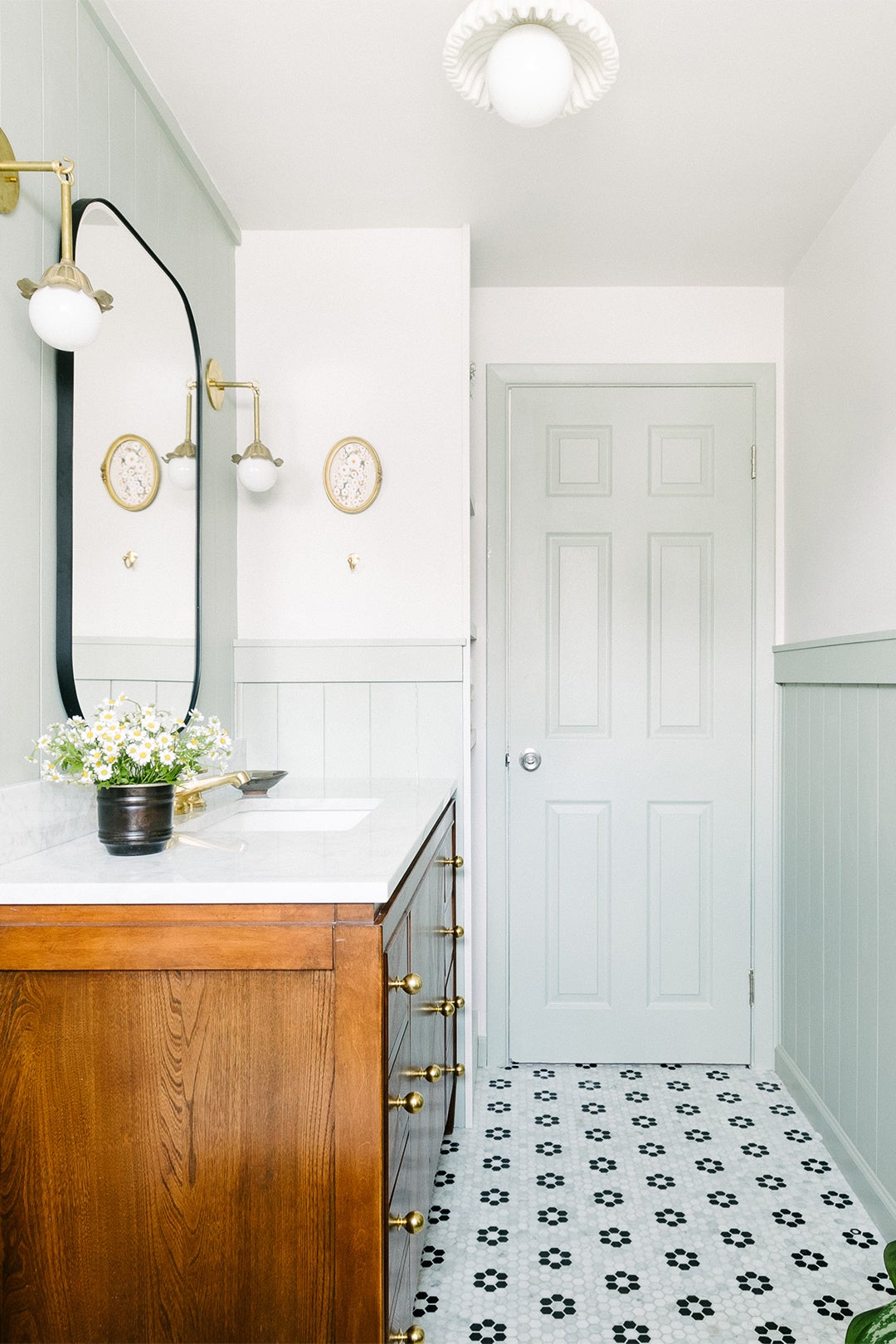
Going with a bespoke wood vanity would have stretched the timeline and the budget, so Baran opted for a $1,600 ready-made one that’s souped up with drawers and cabinets. “The chances of kids keeping open shelving clean is slim to none, so we knew it had to have a lot of closed storage,” she says. Since she knew the family’s little ones would likely be using the bathroom at different times of day, she stuck with a single sink setup over a double one, offering up more countertop space for things like toothbrushes, cotton swabs, and soap. For a custom touch, she switched out the hardware for classic brass balls from Rejuvenation and a splurge-worthy unlacquered brass Waterworks faucet.
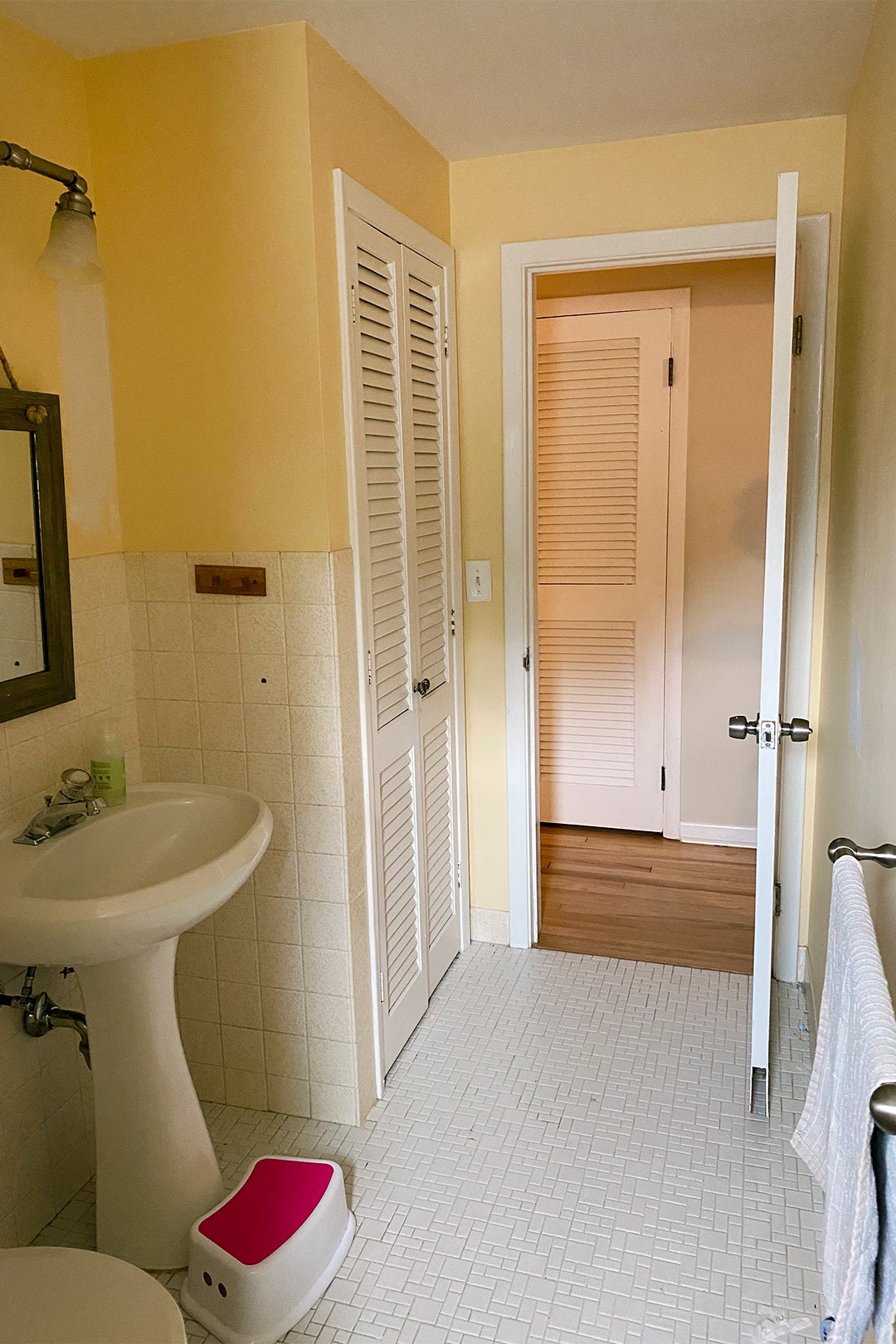
Ripping out the old linen closet not only made way for the fresh vanity but also a 14-inch-wide shelving nook with a superslim hamper niche hidden below it. This way, when dirty socks come off, they can be immediately tossed in with the next laundry cycle.
Flower Power
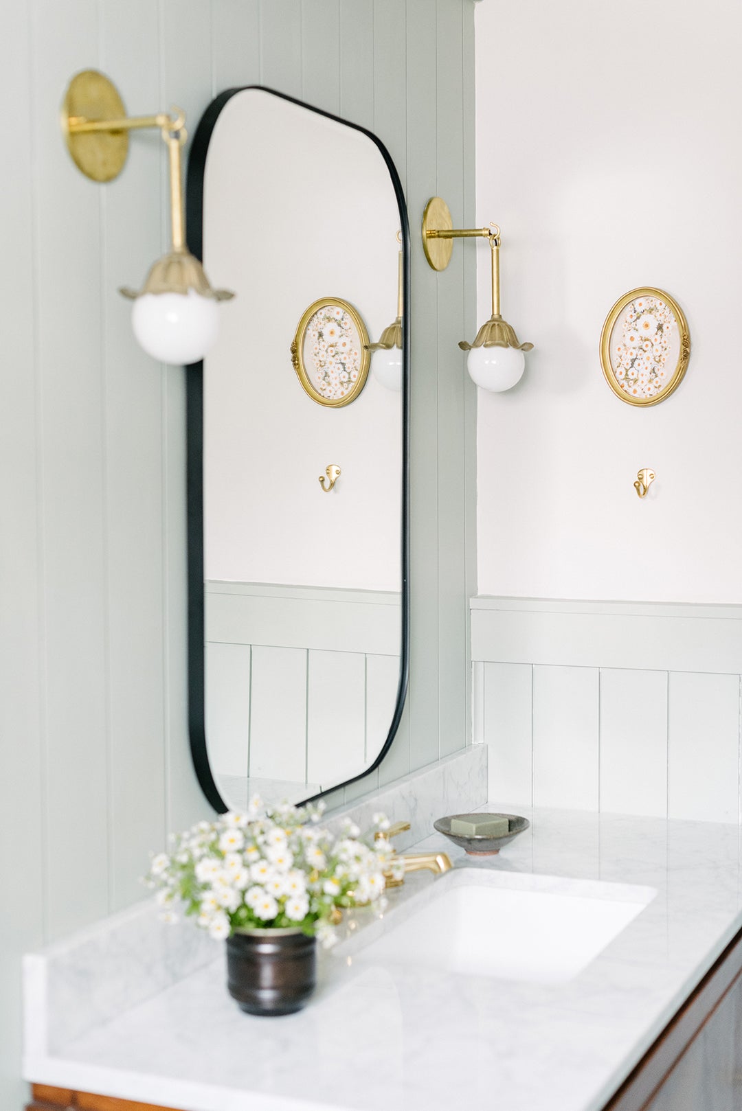
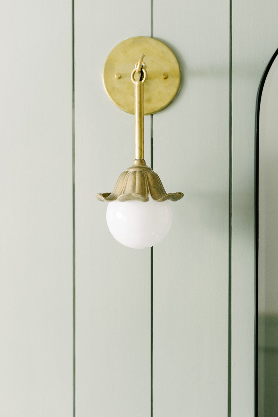
While the goal of the renovation was to make the room functional for three kids under 7, Baran didn’t want it to read overly childish. The designer found a balance with subtle yet playful floral motifs, seen in the black and white hexagon floor tiles, brass petal sconces, and fluted flush-mount light. Now the space is a place for each child to grow into while letting their personality bloom.
The post A Drop-In Tub Is a Kids’ Bathroom Must, But It Doesn’t Have to Be White and Boring appeared first on domino.

